Role

User Research
Product Strategy
IA
UI Design
Interaction Design
Tools
Figjam
Notion

Dovetail
Figma
Slack
Timeline

5 weeks
3 team members
The Problem
While Sofar Sound's website is quite robust, there were quite a few issues that we found with the search function. Within the product there is only a search bar (two on the home page) that is clunky and overwhelming. When you do finally select a location, you are given a minimal amount of tags to look through and (while we understood this was the point), you were given no information about the venue or the genre you were seeing.
The Solution
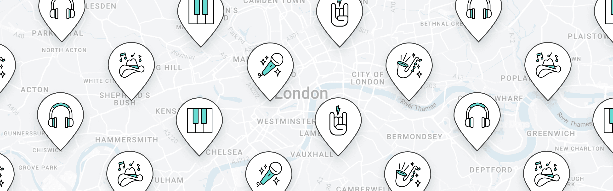
To solve this problem and keep the original intention of the project in place, we ensured the search bar on the home page was larger and had more options to narrow the search down, created a more robust tagging system, and created an interactive map that would be both informational and delightful to the user.
Usability Review
We began by conducting a usability review where we broke down our pain points and wow moments of the search process. While there were a lot of things we loved about the site, there were more pain points than wow moments in the end.

Business & User frustrations
Based on the results of our usability review, we encountered a few frustrations.
Primary Frustration
The search functionality is not as robust as it should be. While the product tries to keep everything very hush hush, they are denying the user any choice which could lead to being disappointed in a show and in turn causing user churn, the tagging system is minimal and inaccessible to those with disabilities, and in general everything about the concert felt almost too hidden.
Secondary Frustration
The visuals actually made the search process confusing. Specifically when you get to the location page, you see a series of icons at the top that appear to be tags that you can click on to narrow down your search. It turns out those were just icons to show what could possibly be at any venue. This caused a lot of confusion for us during our research.
Competitor Benchmarking
After completing the usability review, we moved onto competitor benchmarking where we compared two indirect and one direct competitors to SoFar Sounds in order to identify anything that may help us resolve our stated frustrations.

Information Architecture
To gain further insight on the search process, we broke each page down using Information Architecture. This further proved that the search function was lacking in clarity and information.


User Interviews
To gain some real world insight on these user frustrations, our team interviewed three wonderful volunteers to tell us about their experience using the product as is.

Using Dovetail, we took our interview transcripts and narrowed down key frustrations, high points, and wishes of these three users. Topics we were drawn to included wanting to see a visual calendar, visual availability cues, wanting to see price ranges and genres, and wanting to save a particular location to return to.

Problem Space
By combining the results of the usability review, competitor benchmarking, information architecture, and user interviews, we were able to define the problem space
Who is affected
New users trying to understand the company and find concerts.
What is the problem
The search functionality is unclear and inaccessible.
Where does the problem occur
The problem starts on the home page and continues to the location specific page.
Why does the problem occur
The problem occurs due to the information being clunky, there being a lack of information provided, and the visuals on the site making the information confusing.
Why is the problem important
The problem creates a poor experience for new and even some returning users, detering them from returning to use the site as a whole due to initial frustrations.
When does the problem occur
The problem occurs at the beginning of the search process.
After defining this problem space, we came to one conclusive statement to guide us in our ideation process using a "how might we" statement.
How might we expand upon the search experience to make it more informational and accessible to users?
Ideation
Now that the problem has been defined, we took those items and selected the ideas we found best matched our solution using a priority matrix, and each completed a crazy 8's challenge to rapidly visualize these ideas.
Using the data collected from the user interviews we conducted, we wrote out all of our ideas on how to improve the search function and voted on their importance.

After reviewing the matrix we realized that some things we wanted to add just wouldn't make sense based on both the amount of time we had to complete the project, and the understanding that some of these items wouldn't actually improve the product. We took our top favorite items and listed them out, and made a plan on how to execute them.

Using the notes above, we completed a crazy 8's challenge to sketch out as many ideas as possible to further narrow out and plan out what features would be best for the update.

What can we add
We can add a way to select dates and a visual calendar on the home page search, as well as a detailed regional search. On the location page we can include a map and icons to help users visualize where these concerts will be and how much of a genre will be in one area, we can also add tags and visual indicators to help users better plan their experiences.
What can we improve
We can improve the UI in some areas to make the search function and concert cards easier to understand, and to ensure they are informative upon first glance. We can improve upon the location of the search bar on the home page and make it easier to find. We can add more information to the location specific page to help the user have an easier time selecting events.
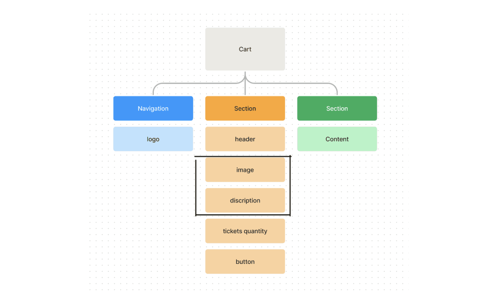
User Flows
Before we could dive into creating our wireframes, we needed to restructure and define the flow of the challenge by creating the current user flow, and refining it to match our goals.


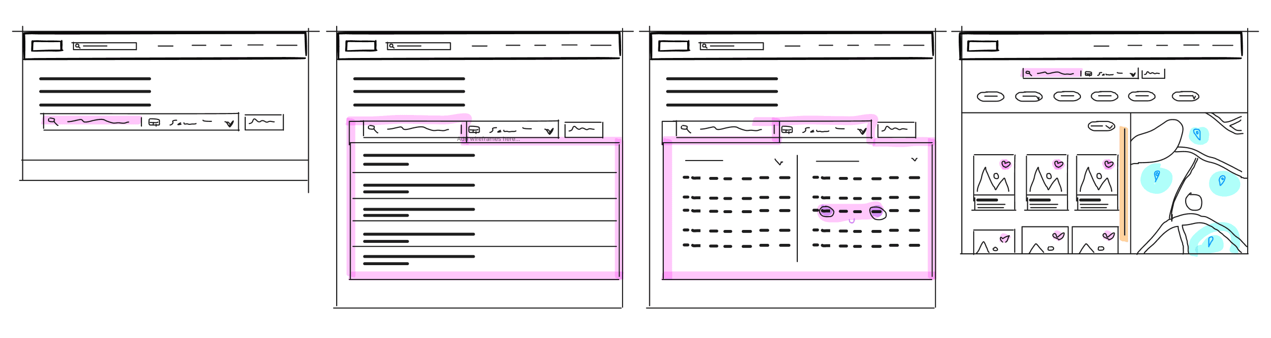
Rapid Prototyping
Once the user flow had been established we moved onto creating our wireframes through rapid prototyping.
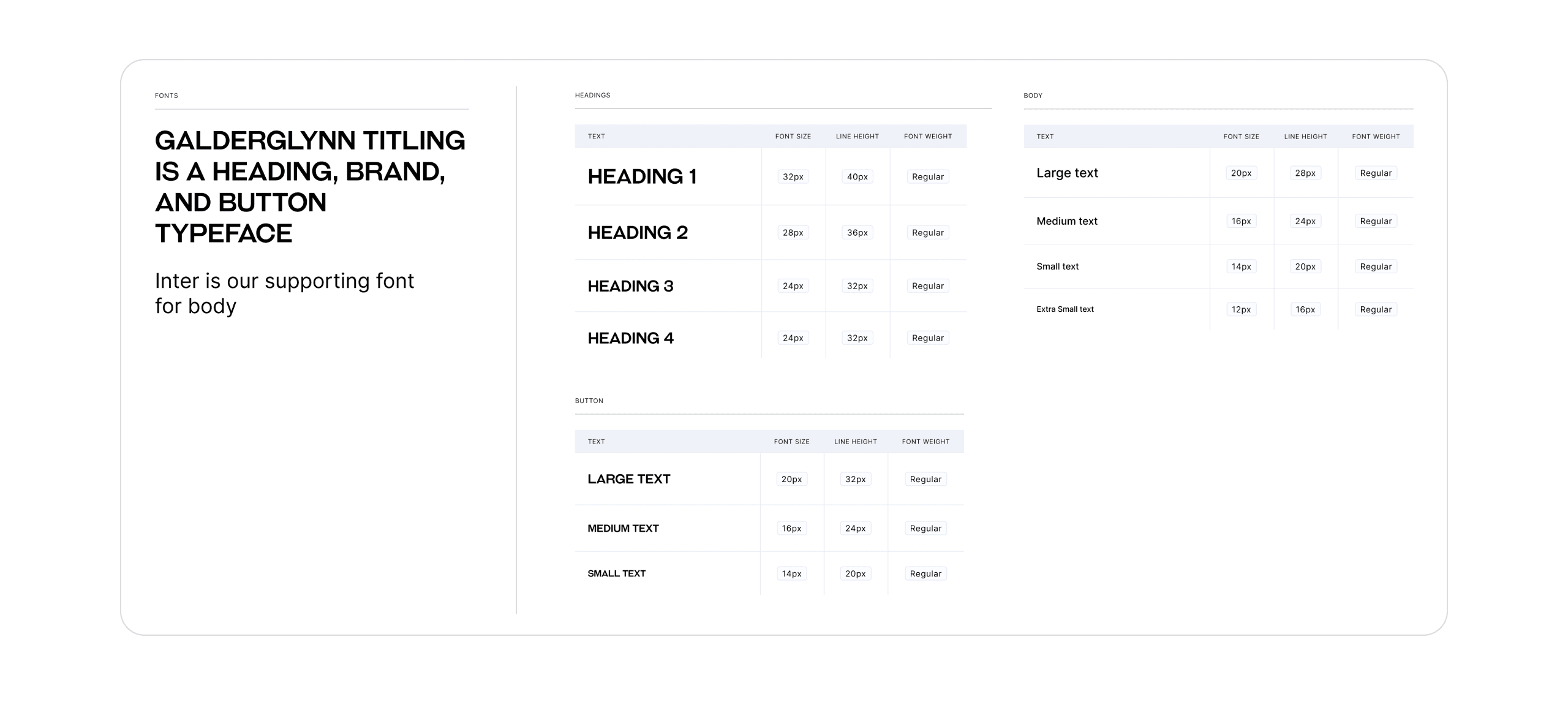
Styles
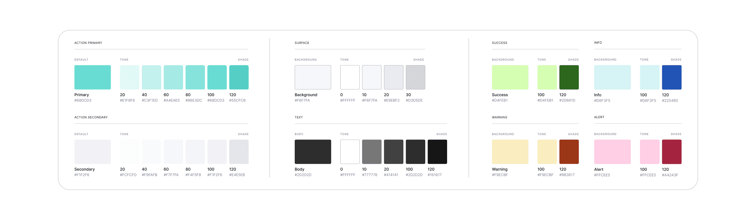
The only typeface we made the decision to update was the heading typeface. We wanted to pick something that was a bit more modern and not so corporate. Galderglynn Titling was the perfect choice due to its weight variation, and sharp edges.
Components
We used the above styles to create a comprehensive set of components to ensure that our prototype would be completely interactive and engaging, and to allow the team to easily replace components within the high-fidelity prototype using assets and iterations. We carefully assigned micro-interactions to each component to create visual cues for the user as they make selections and explore the site.
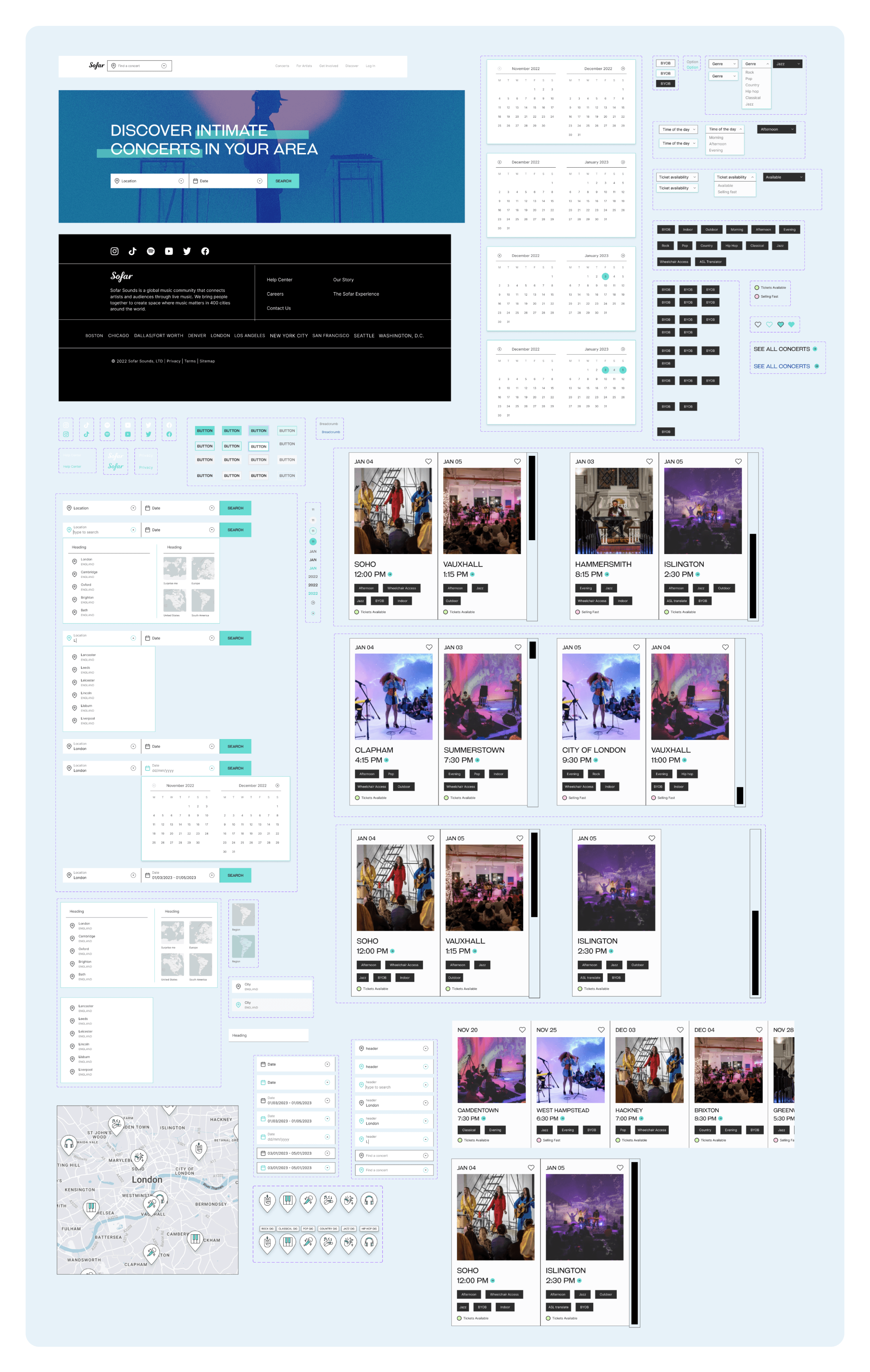
High Fidelity Prototype
After creating our design system, we combined that with our wireframes, designed a set of interactions to enhance the user experience, and created the final product that you see below.
Three key learnings
Adding additional tags made for a much more accessible experience without compromising the experience that SoFar provides. The ASL translator and wheelchair accessible tags make the experience more open to everyone.
While the "surprise me" feature works in theory, it would make more sense if we updated it to work within a specified location rather than a randomized one. It should be updated to be a random concert in an area you choose to visit.
I believe it could be beneficial to add a "radius" selection tool on the home page as an additional option to a specific city. Adding a radius will allow the user to see more options at a distance they're comfortable traveling to.
Next steps
In the next iteration of the site, I hope to clean up the prototype to smooth out some of the page transitions. Additionally I would like to add some items from my key learnings above such as a radius marker, and exploring a better use for a "surprise me" feature.